
Hareem Cheema
T-Mobile: Promotions treatment
Role: Experience design and strategy lead
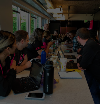
Team: 1 experience designer, 1 design intern, 2 product managers, 1 business strategy lead
I designed a treatment for T-Mobile’s complex promotions that increased conversion and reduced calls to customer support through increased transparency in the way our promotions are communicated.
Overview
T-Mobile offers a lot of complex promotions to our customers and only a handful of these are reflected digitally in the checkout experience. The current cart experience does not provide the customer enough information to create trust and confidence because we do not do a great job communicating how and when they will receive their promotion.
Top Prospects primary visit reasons

Source: Digital Voice of the Customer report
Website barriers by engagement group
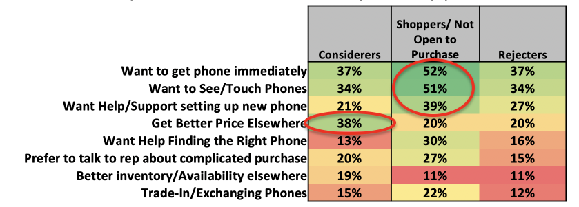
Shoppers not open to purchase cite more barriers but are particularly dissuaded by desire for immediacy and seeing/touching the phone before buying
Considerers may be motivated to convert via online price offers/specials
Who are our customers?
Considerers
Will shop on T-Mobile.com and are open to purchase online.
38% of these customers find a better price elsewhere.
Shoppers
Will shop and browse on T-Mobile.com, but not open to purchase online.
Rejecters
Will not shop online.
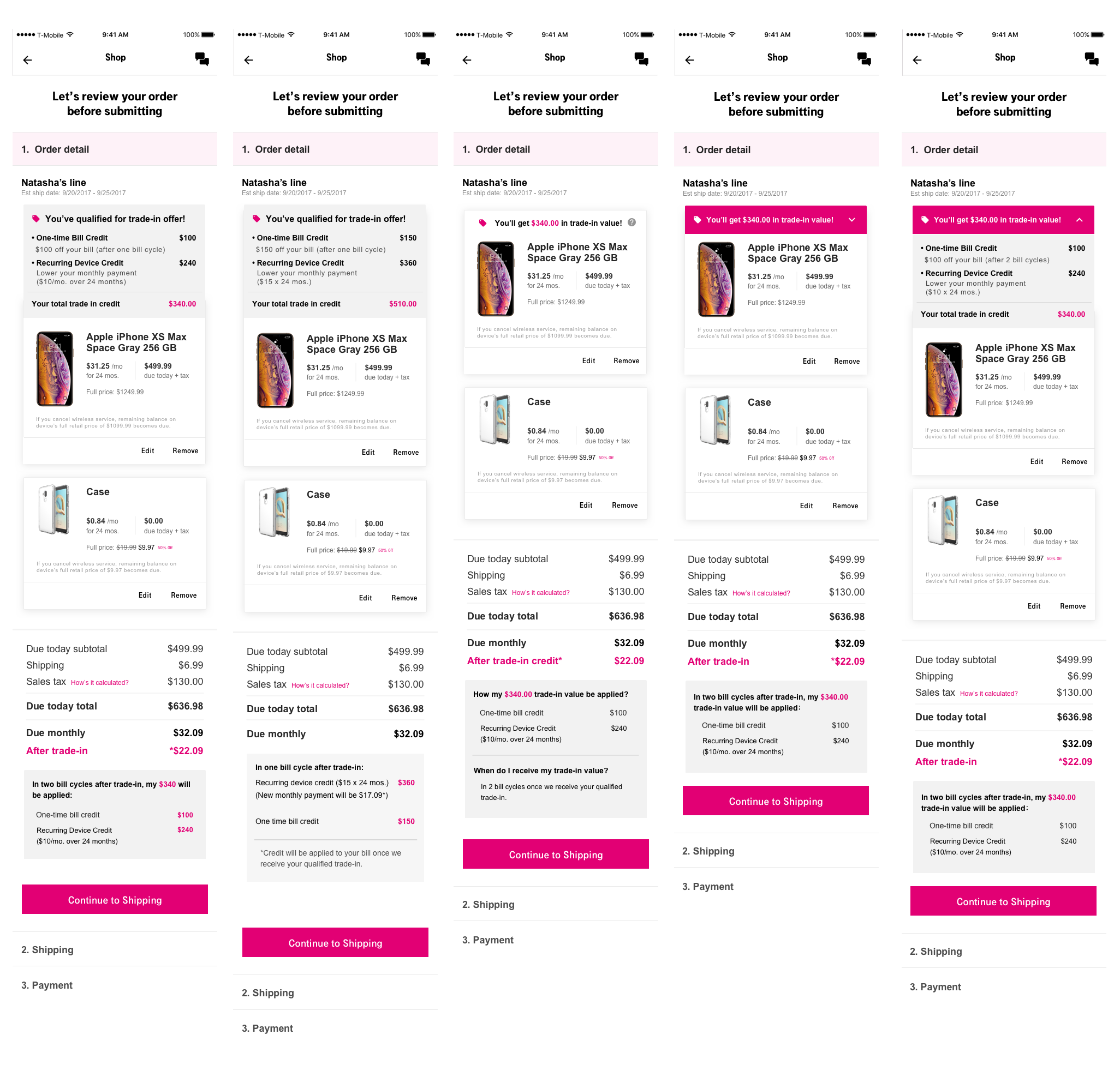
Current experience
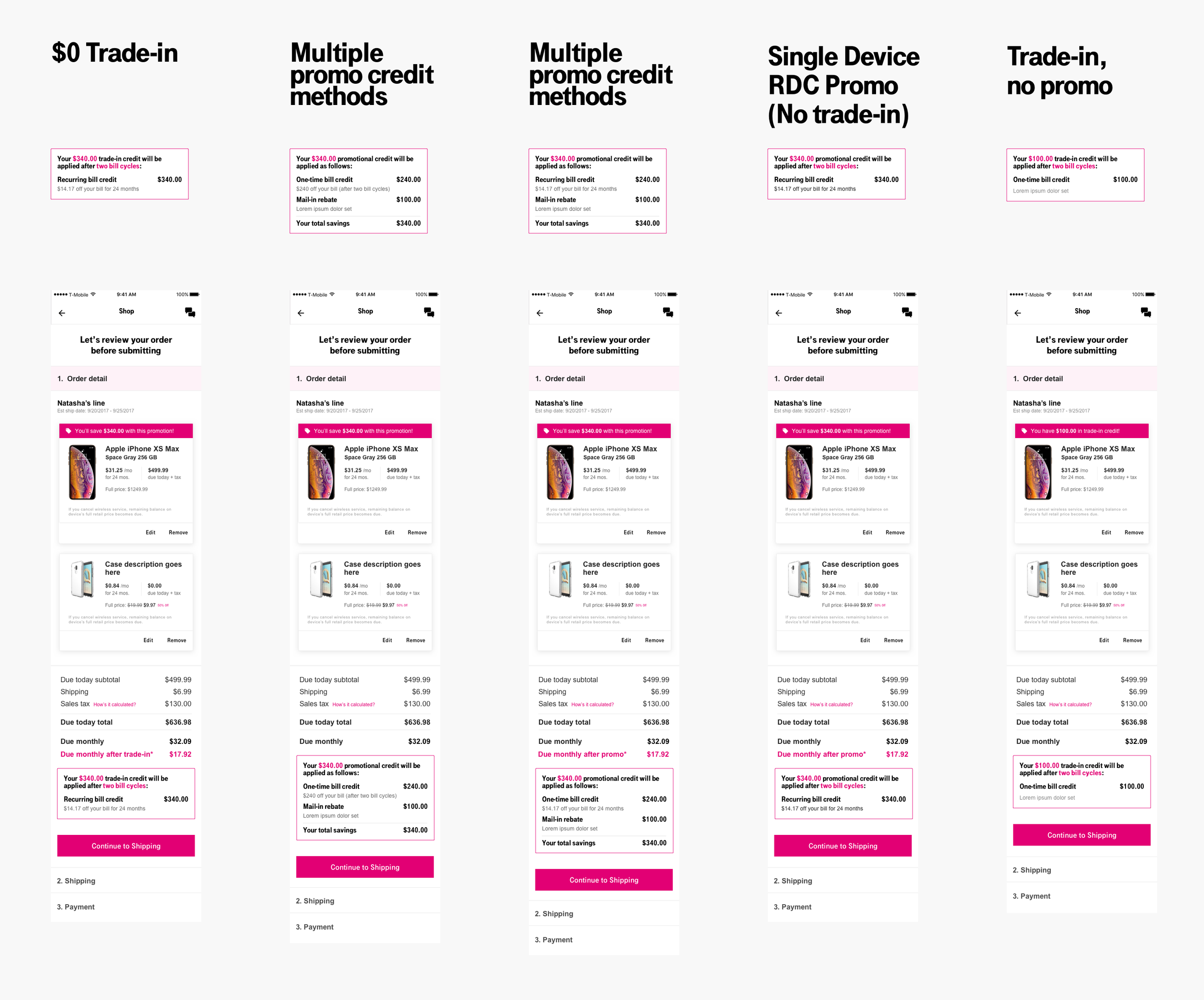
We decided to focus specifically on trade-in promotions because they are the most common and complex promotions we offer to our customers.

How might we increase customer confidence in our complex promotions during the checkout experience?
New promotions treatment experience goals
Improve customer confidence to increase conversions
Reduce customer calls to care about promotion details
Help customers understand how and when they will receive their promotion credit
Make the solution flexible and scalable for all promotions
Research
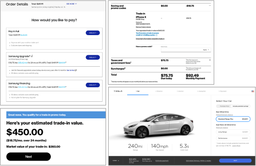
Competitive Research
Initial meeting with the in-store customer care team
Key insights from looking at competitors and different e-commerce sites:
Show market value
Clearly communicate savings
Show updated monthly pricing
Insights from our in-store customer care team:
What we learned about our customers:
Ask for cost breakdown in store
Seek transparency
Like seeing that they’ll pay less monthly (in lieu of instant discount)
Hypothesis
Increased transparency will increase conversion, increase confidence and decrease care calls.
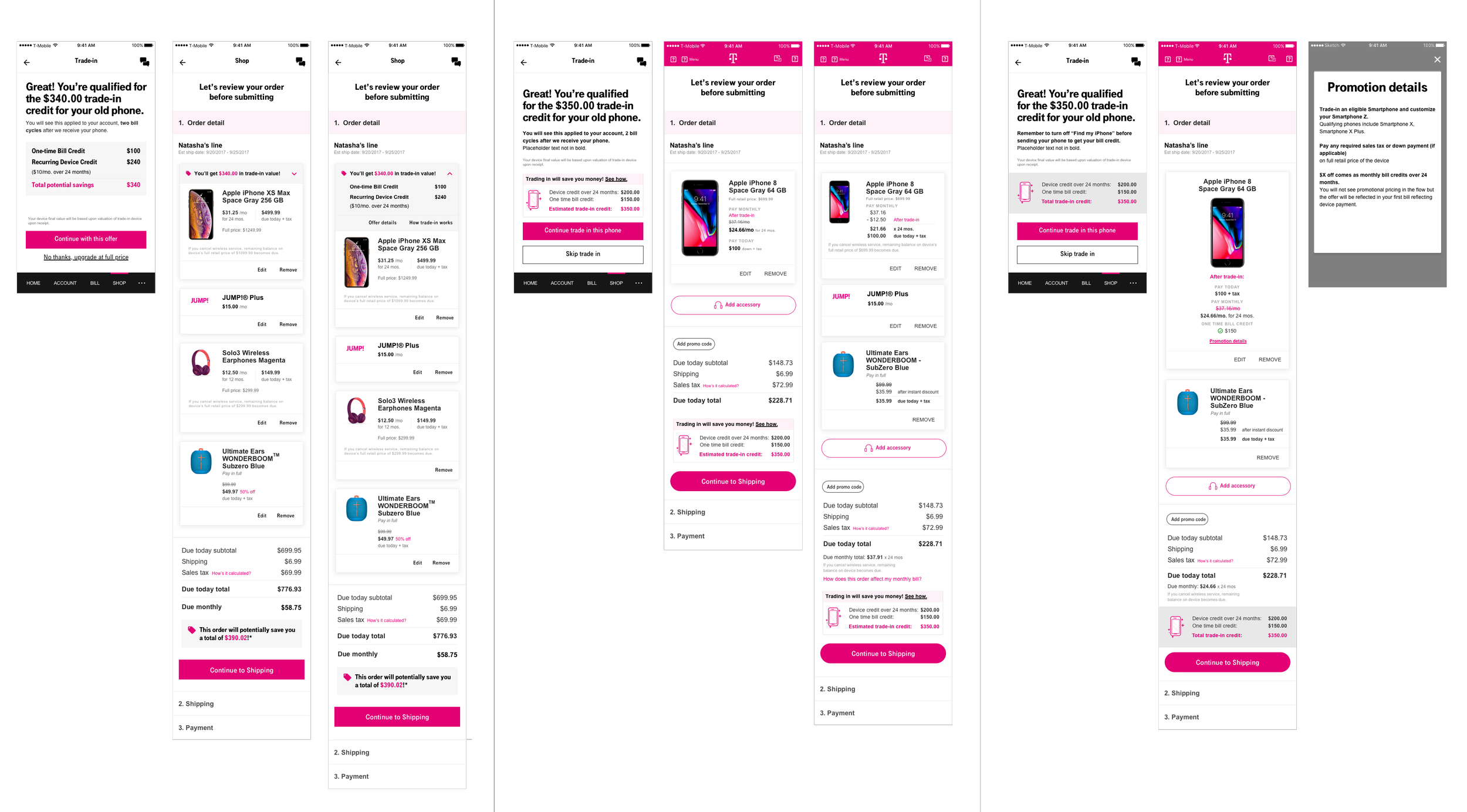
Proposed enhancements to key touch points in the current experience
Ideas
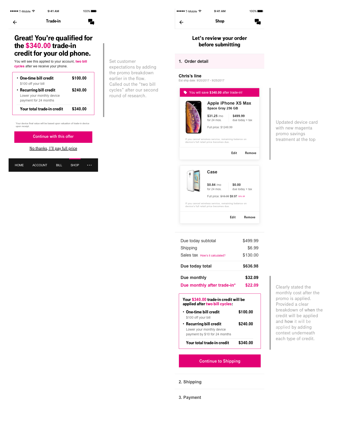
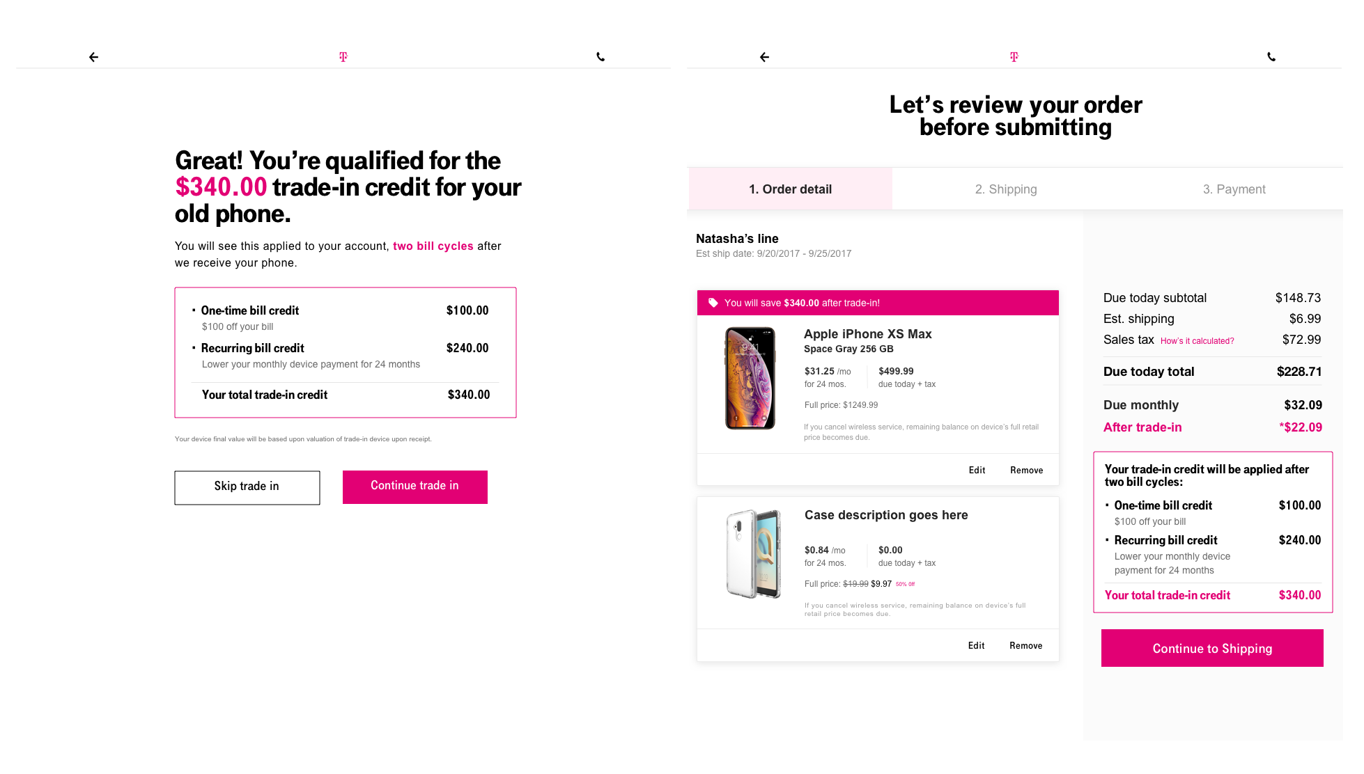
After seeing how the customer care team explains promotions (specifically trade-in promotions) in store, it made sense to add a similar breakdown on the trade-in summary page as well as in cart. The idea is that we should be doing the math for customers rather than making them do the work.
Usability Research
Test options with the customer care team
Key insights from the prototype testing we did with the care team:
Pay close attention to tone of voice
Call out “after 2 bill cycles”
Emphasize savings
Guerrilla testing around the office

Key insights from our three rounds of testing (4 people in each round, 12 participants total):
Ignored the clickable gray accordion on the device card
Scrolled right to the bottom and spent most of the time there
Reiterating the total promotion value helped make the connection
Thought they’d receive the credits right away
Solution
In our final round of testing we tested the solution below and found that all participants:
Understood when the promo credits will be applied
Made the connection between the recurring bill credits and monthly price reduction
Felt confident that they would receive the promotion
Stress test the solution to ensure flexibility and scalability for “n” types of promotions
Next steps and impact
We were able to prove a business case and got funding to move ahead with a new promotions treatment that proposed doing the math for the customers vs making them calculate their promotional savings. During this time our cart also got redesigned and another designer was able to test out additional colors for promotions. Ultimately, we landed on a more subtle, green tag treatment to call out promotions. Customers in follow up usability testing reported a stronger association with the color green and savings so it performed better than the magenta.
As a result of the new promotion saving messaging and breakdown, we increased our prospect orders by 7%.

Promo treatment explorations done by another designer on our team
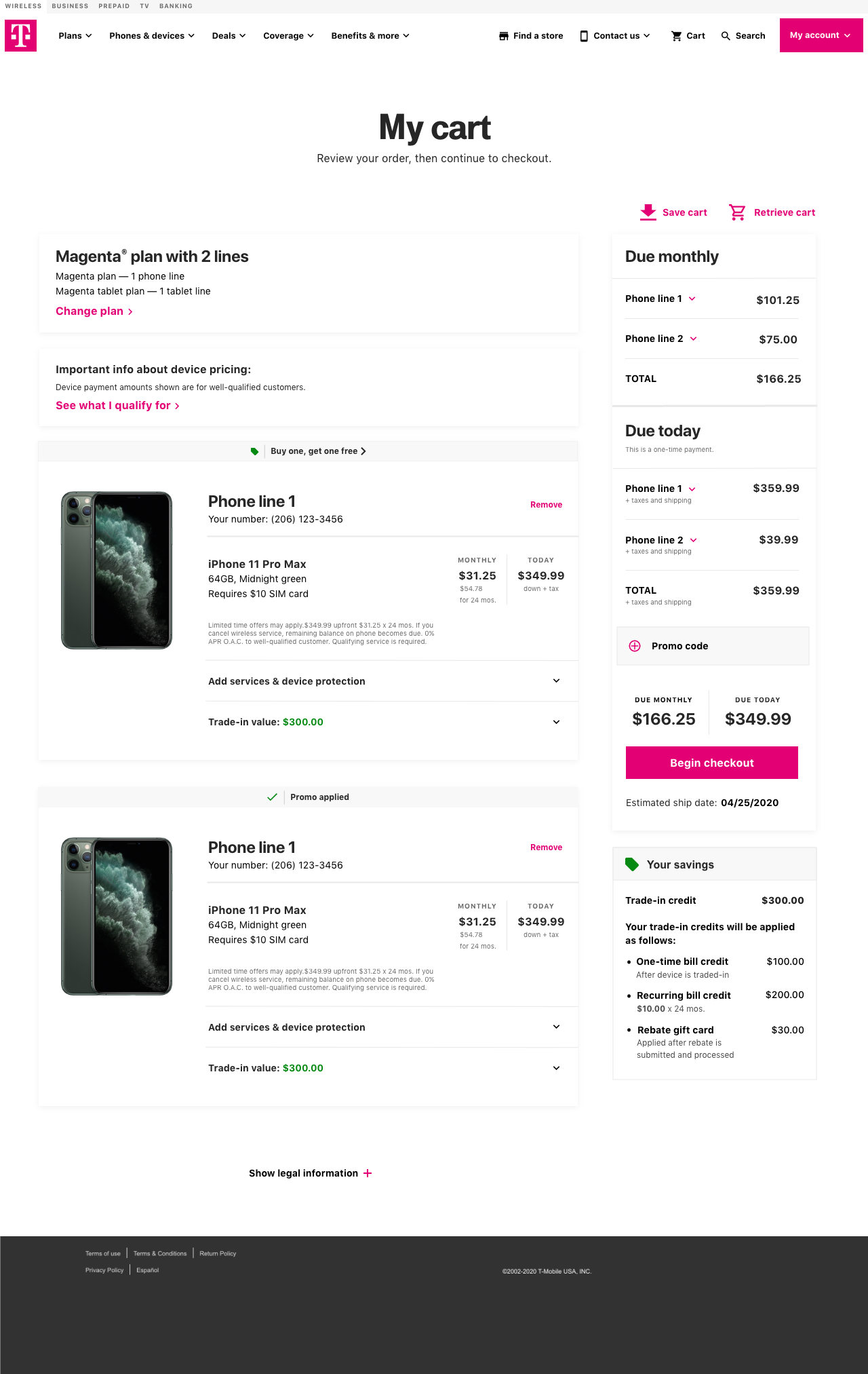
New cart design done by another designer on our team
What I would do differently
Do more usability or A/B testing to understand if the breakdown shown earlier in the flow (on shop pages, before trade-in steps) would have an impact on conversion and customer confidence
Understand the checkout flow better to ensure that customers don’t fall out due to the additional steps in the checkout process